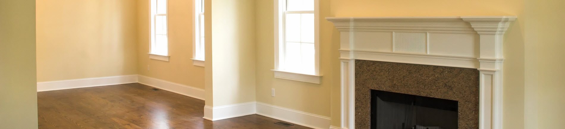

Ensuring your employees are happy will lead to high productivity. There are many different ways you can impact your staff, but creating the right environment for them to work every day in should top the list. Not only can you influence the employees with the right mood, but you can also impact the customer’s mood. Taking the time to learn the color psychology can help you reach optimal work environments, both from the crew and the clients. With that in mind, we at New York Painting Services would like to take the opportunity to briefly discuss interior painting colors at work.
Business Office & Workplace Paint Color Schemes
Green: Productivity is affected by green as it encourages broader creativity and thinking. Green is ideal for boardrooms and work areas to ensure the creative juices flow towards innovating thinking.
Blue: Ease is helpful in stressful jobs. When the business is demanding, the crew and customers can use some peace and a dose of serenity and tranquility. To neutralize the chaos and edgy mood, opt to paint the interior blue for a nice calming effect. Consider the relaxing quieter areas, like break rooms, where employees can regroup.
Orange: A good value is often associated with orange according to experts. To communicate to your customers that your product or service is not only the right price with the use of orange accents.
Red: Red is something that should stay out of the work place. It promotes anger, aggression, as well as untidiness. With a bolder red, the heart rate and blood pressure can also increase. Avoid allowing your workplace to become a place of conflict and hostility. In the vent your business involves physical activity however, use read as an accent color.
Yellow: Nurture idea thinking, bringing energy, optimism, and happy feelings which really help give professionals a burst of positive vibes. Yellow, however, is better used as an accent though because too much stimulates hunger and feelings of anger.
Gender Differences in Color Perception
In a study performed by the University of Texas, it was discovered that color can also affect men and women differently. Offices painted oranges and purples would trigger sadness in men where women experienced those feelings in white and beige office spaces.
Paint Colors for Focus & Concentration
Keeping the employees on task in order to meet deadlines, calls for the interior paint to be in shades of blue and green to increase focus and efficiency among them. Green is ideal as it doesn’t cause eye fatigue and contributes to the calmness when the staff has to put in long hours where blue is a stabilizing color. However, keep in mind that darker tones of greens and blues can induce feelings of sadness.
Interior Painting in Brooklyn, Yonkers, Tarrytown, Rye, Larchmont, Scarsdale, Chappaqua, Glen Head, White Plains & Manhattan, New York
Painting the interior of your business can be a challenge when balancing a positive mood with the employees as well as considering enthusiasm in your customers. New York Painting Services color specialists can help you find the right color combination throughout your commercial space to effectively balance the colors exceptionally well. In addition to finding the right colors, our team is experience and skillful artisans that can paint your walls in a timely manner. Call us today to get started on your commercial painting project in the New York and New Jersey area.